Tuesday, May 15, 2007
Saturday, April 21, 2007
ART for the HOMEBOUND

Art for the Home Bound is a program which provides artwork created from the Art and
Sunday, January 14, 2007
Silent Night Step By Step
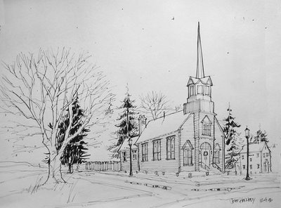
Here is the original sketch completed with felt tip pen and gray marker. This is the stage where I work out the composition for the painting. A number of sketches were completed so I could work out various compositional experiments.
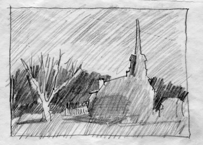
Since this was to be a night or dusk scene, the values were pushed a few steps darker. No white paper would be visible. My target value pattern was a dark shape surrounding a light area (the roof).
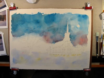
I completely soaked the paper and dried the church steeple area by blotting it with a cloth. I loosely applied the sky keeping in mind that I wanted it dark and that it would dry lighter. I gradated the sky from dark to a lighter area on the right hand side. I also changed the color for the sake of variety. I also added a yellow and red lightly and loosely in the snow area. This was also for variety.
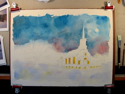
A yellow and red was was added in the window areas of the church. This same wash was also added where the luminaries light the path to the church.
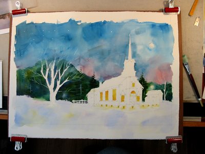
The treeline was added varying the color as I went.
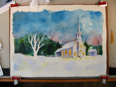 Washes were added to the church to define the light and shadow sides. These washes were also varied.
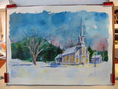
More detail was added to further define shapes.
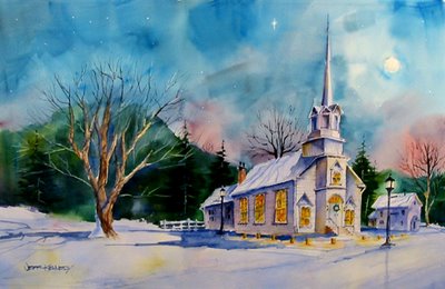
This is the final. It was used for our family Christmas card. The church is based on our church that we attend. The steeple was changed to show the steeple originally built with the church. Our church puts out luminarias every Christmas eve. When there has been a fresh snow, the reflections of the warm light against the snow is such an inviting view.
Thursday, October 19, 2006
WATERCOLOR STEP-BY-STEP
This is the first painting I completed since taking my workshop. I felt a little rusty, but it felt good to throw some paint down on the paper. I will take you thru the process step-by-step. This painting was donated to the Midwest Chapter of Reeling and Healing. It will be auctiontioned off at a benefit with the proceeds going to the local Midwest Chapter. Reeling and Healing champions fly-fishing retreat programs for women diagnosed with or surviving cancer.
The first step of the process is to create my working sketch. This is completed with black pen and gray markers. My sketches are done in a 18"x24" sketch pad. The composition is from various elements brought together.
 The next step was to pencil in the sketch onto watercolor paper. I used 140 lbs. Startmore Gemini for this painting. I changed the position of the drift boat because I thought it garnered too much attention in the position as shown in the working sketch. I also removed the rocks and changed the contour of the road. I typically sketch on my watercolor stock using a 2B or 4B pencil.
 The next step is very important an often a step painters skip. I created a thumbnail value sketch to guide me in my painting. I will typically do 2-3 quick thumbnail value study roughs trying various value patterns until I find one that fits. I use a 4B and a flat carpenters pencil so I can quickly rough in the values. The value pattern is used was to have a light piece(small) surrounded by a dark shape (medium) on an overall midvalue field (biggest)

Now that I have a value pattern and my sketch is on my watercolor paper, it is time to get down to business. I thoroughly soak my paper and lay in the sky. I try to limit my time in the sky to 30 seconds. Anymore and I have the tendency to fiddle with it. I tip my paper on end to let the colors blend. I graduated the sky from dark to light. I also layed in the forground field using a large brush. The first steps look ugly, but you try to loosly get color and value in without the detail. Hopefully this will produce a fresh loose painting.

The next step I kept working in the colors and values. Referring to my value sketch. Since the midvalue is the largest, I typically work on this first. I can always go back and darken valyes if I need to. I try to not go into area more that twice. This helps to keep the painting looking overworked and muddy.

I wanted the painting to have a warm dominance. I contued to work the color and values, then I let the painting dry. The final step was to come in with the rigger and add my lines and my darkest darks. And here is the final.
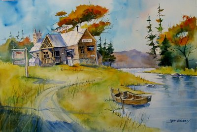
Now it is critique time. I did not hit the dark values in the trees on the left side. They needed to be darker. The shape of the tree over the roof neede to foil the flyshop sign a bit better. The trees to the left of the fly shop are too similar in size and shape. No variation in size and the angles are similar. I will do this painting again, and try to do a better job with the values and make some additional compisitional adjustments along the way. Stay tuned for the next painting.
The first step of the process is to create my working sketch. This is completed with black pen and gray markers. My sketches are done in a 18"x24" sketch pad. The composition is from various elements brought together.
 The next step was to pencil in the sketch onto watercolor paper. I used 140 lbs. Startmore Gemini for this painting. I changed the position of the drift boat because I thought it garnered too much attention in the position as shown in the working sketch. I also removed the rocks and changed the contour of the road. I typically sketch on my watercolor stock using a 2B or 4B pencil.
 The next step is very important an often a step painters skip. I created a thumbnail value sketch to guide me in my painting. I will typically do 2-3 quick thumbnail value study roughs trying various value patterns until I find one that fits. I use a 4B and a flat carpenters pencil so I can quickly rough in the values. The value pattern is used was to have a light piece(small) surrounded by a dark shape (medium) on an overall midvalue field (biggest)
Now that I have a value pattern and my sketch is on my watercolor paper, it is time to get down to business. I thoroughly soak my paper and lay in the sky. I try to limit my time in the sky to 30 seconds. Anymore and I have the tendency to fiddle with it. I tip my paper on end to let the colors blend. I graduated the sky from dark to light. I also layed in the forground field using a large brush. The first steps look ugly, but you try to loosly get color and value in without the detail. Hopefully this will produce a fresh loose painting.

The next step I kept working in the colors and values. Referring to my value sketch. Since the midvalue is the largest, I typically work on this first. I can always go back and darken valyes if I need to. I try to not go into area more that twice. This helps to keep the painting looking overworked and muddy.

I wanted the painting to have a warm dominance. I contued to work the color and values, then I let the painting dry. The final step was to come in with the rigger and add my lines and my darkest darks. And here is the final.

Now it is critique time. I did not hit the dark values in the trees on the left side. They needed to be darker. The shape of the tree over the roof neede to foil the flyshop sign a bit better. The trees to the left of the fly shop are too similar in size and shape. No variation in size and the angles are similar. I will do this painting again, and try to do a better job with the values and make some additional compisitional adjustments along the way. Stay tuned for the next painting.
Friday, July 21, 2006
My New Friend

I hope everyone is having a great Summer! It is time to start gearing up for the upcoming Art Ministry! I hope everyone has found time to sketch. I have read about a sketchbook that alot of my fellow artist have been using. It is called a Moleskine. Now this may be new to you, but it has quite a history.
"MOLESKINE IS THE LEGENDARY NOTEBOOK, USED BY EUROPEAN ARTISTS AND THINKERS FOR THE PAST TWO CENTURIES, FROM VAN GOGH TO PICASSO, FROM ERNEST HEMINGWAY TO BRUCE CHATWIN.
This trusty, pocket-size travel companion held sketches,
notes, stories and ideas before they were turned into
famous images or pages of beloved books.
Originally produced by small French bookbinders who
supplied the Parisian stationery shops frequented by the
international avant-garde, by the end of the twentieth
century the Moleskine notebook was no longer available.
In 1986, the last manufacturer of Moleskine, a family
operation in Tours, closed its shutters forever.
“Le vrai Moleskine n’est plus” were the lapidary words
of the owner of the stationery shop in Rue de l’Ancienne
Comédie where Chatwin stocked up on the notebooks.
The English writer had ordered a hundred of them before
leaving for Australia: he bought up all the Moleskine
that he could find, but they were not enough.
In 1998, a small Milanese publisher brought Moleskine
back again. As the self-effacing keeper of an extraordinary
tradition, Moleskine once again began to travel the globe.
To capture reality on the move, pin down details, impress
upon paper unique aspects of experience: Moleskine
is a reservoir of ideas and feelings, a battery that stores
discoveries and perceptions, and whose energy can be
tapped over time.
The legendary black notebook is once again being passed
from one pocket to the next; with its various different page
styles it accompanies the creative professions and the
imagination of our time. The adventure of Moleskine
continues, and its still-blank pages will tell the rest."
Quoted from the official Moleskine site
The above sketch was my first in my brand new 5" x 8" Moleskine.
You do not have to travel to Italy to get one. You will find a large selection of them at Barnes and Noble. They are very affordable and have a high quality paper in them. They even have a small pocket in the back to keep loose pieces of paper. This size sketchbook and my small travel watercolor case makes the perfect compact combination!
The pages take watercolor and different media well. I started the above sketch by just throwing some watercolor on a page and letting it dry. I then drew the old Brownie camera from my collection in waterproof black ink. I then went over that with more watercolor.
The Moleskines are nice and compact, so you could even bring it to church and whip out a quick sketch during the sermon!
In the coming weeks I will post some step by steps of my sketches. My hope is that you will sketch along with me, and learn some new techniques.
Some other cool Moleskine sites include:
Moleskine Art
Moleskinerie
Monday, May 01, 2006
This Is So True
“There are those of us who are always about to live. We are waiting until things change, until there is more time, until we are less tired, until we get a promotion, until we settle down — until, until, until. It always seems as if there is some major event that must occur in our lives before we begin living.” - George Sheehan


